AppDynamics
Raising the visual bar for AppDynamics
Defining a visual language worthy of the platform underneath.
Direction 3 explored how a new visual language could express the scale and technical ambition of the platform underneath.
The context
The product was being reinvented. Its visual language needed to catch up.
Project Levitate was a complete redesign of the AppDynamics application-monitoring platform. In parallel, we explored how Particle—the existing visual system—should evolve to make an extremely complex product clearer, more coherent, and more distinctive.
Challenge
We could answer more questions than ever—but the volume and granularity of data made the product harder to consume and navigate.Opportunity
Levitate let information architecture and visual design work together to help people navigate complexity and make informed decisions efficiently.The visual baseline
A capable product carrying too much interface.
The existing experience supported sophisticated analysis, but navigation layers, panels, borders, and status signals competed for attention. Levitate was an opportunity to preserve that analytical depth while creating clearer hierarchy, stronger focus, and a more deliberate visual language.
The strategy
Organize the interface around how people make decisions.
Dense data becomes useful when the interface reveals the right level of context at the right moment. We structured the experience as a progressive decision path.
- 01OverviewSee enough to prioritize.
- 02FocusFilter and sort what matters.
- 03ContextExplore relationships and detail.
- 04DecisionAct with greater confidence.
A system for hiding complexity
Make relationships visible without showing everything at once.
The hypergraph emphasized relevance and context while suppressing the rest of the system. Users could move through enormous datasets with fewer clicks and more confidence.
Design principles
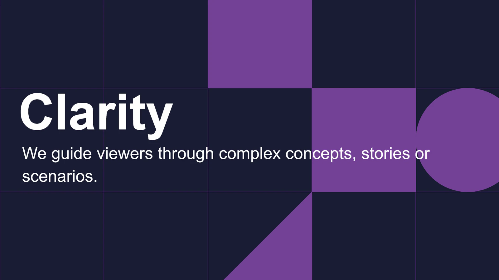
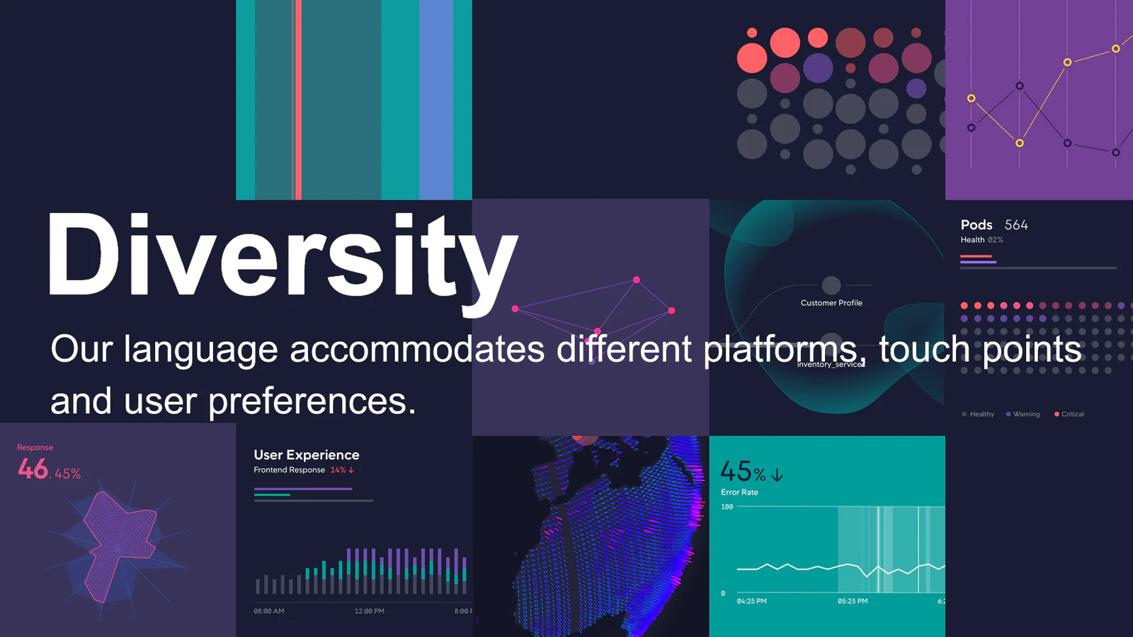
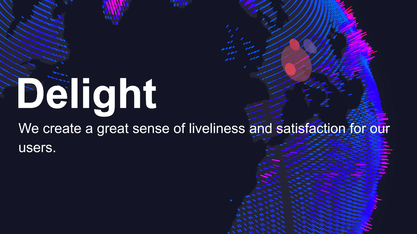
Clarity, diversity, and delight.
The principles gave each direction a shared standard while leaving room to explore very different visual expressions.
The exploration
Three directions made the strategic tradeoffs concrete.
Instead of polishing one answer in isolation, I framed three positions that leadership could compare: continuity, Cisco alignment, and differentiation.
01
Evolve Particle
Designed by mePreserve continuity with AppDynamics while making the interface feel more precise, fluid, and contemporary.02
Adopt Cisco Momentum
Directed by meTest the strategic value—and limits—of aligning the product with an established Cisco design language.03
Create the next generation
Collaborative directionUse a more expressive visual system to signal the magnitude of the new platform underneath.These screens used forward-looking workflow concepts to test the visual language. They were not proposed final UX.
Direction 1 · Designed by me
Evolve Particle without losing its authority.
This direction retained a connection to AppDynamics while pushing the system toward a stronger grid, more deliberate color, richer data visualization, and a UI that could fluidly reconfigure around the task.
It felt connected to the established product and could build on a well-supported language.
The evolutionary stance made it harder to communicate how different the Levitate platform was becoming.
Direction 2 · Directed by me
Bring AppDynamics into Cisco's Momentum language.
Another designer executed this direction. I defined its strategic role in the exploration, selected the designer, reviewed the work, and presented it alongside the other options.
A Cisco-forward stance supported cross-selling and a tighter portfolio story.
The language felt optimized for a less technical audience than the typical AppDynamics customer.
Direction 3 · Collaborative
Use a new visual language to signal a new platform.
I collaborated with another designer on a more expressive direction built around Clarity, Diversity, and Delight. Living forms and luminous data visualization made the interface feel less like a static dashboard and more like an active system.
It visibly represented the platform shift and positioned data visualization as a competitive advantage.
A genuinely new system would require organizational commitment to build and sustain.
The decision
We moved forward with Direction 1.
It gave the product a significant visual step forward and expressed the principles clearly, while staying grounded in components we already had. That made it the most realistic path for engineering—and the least disruptive way to raise the product’s level of craft.
Design leadership
The exploration made the tradeoffs visible.
Side by side, the directions turned an abstract conversation about visual sophistication into concrete choices about continuity, brand alignment, differentiation, and investment.
Turned an open-ended visual question into three meaningfully different strategic positions.
Selected designers, set briefs, reviewed the work, and kept the directions distinct enough to be useful.
Presented the work to leadership as a set of product and brand tradeoffs—not a taste contest.
View more workVisual sophistication is not decoration. In a complex product, it is how the interface communicates hierarchy, confidence, and the ambition of the system behind it.